top of page
.png)
Agenda
Overview
This project involved redesigning an internal company calendar.
The Problem
The original calendar was difficult to use with a non-intuitive interface and limited functionality. Key features were missing, impacting daily tasks and overall usability.
Role
Product Designer
The Solution
Improve the user experience by adding missing features and updating the UI to match the new system design.
Challenges and Constraints
The previous calendar system had several usability issues that hindered user experience.
Key challenges included:
-
Missing Key Features: Critical features such as event categorization, color coding, recurring events, and real-time notifications were absent, making the tool less effective for its intended purpose.
-
Inconsistent Design: The design didn't align with the UTT system, leading to inconsistency and confusion.
-
Poor Text Contrast and Visual Hierarchy: This reflects the core problem of the lack of text color changes, which negatively impacted readability and overall user experience.
Research
To understand the root causes and user needs, we conducted thorough research:
-
User Interviews: Sessions with internal users helped us identify pain points, such as difficulty in categorizing events and tracking recurring ones.
-
Competitive Analysis: We examined other calendar tools in the market to benchmark features and user experience (Google Calendar, Outlook Calendar, Apple Calendar).
Design Strategy
-
Collaborative Iteration: Iterative feedback sessions with users and stakeholders were held to refine the design and ensure it met user needs.
-
Accessibility & Consistency: We focused on aligning the new design with the company's overall design system, ensuring accessibility and consistency across tools.
Day view
Before
%20(1).png)
After
.png)
Week View
Before
%20(1).png)
After
.png)
Month View
Before
%20(1).png)
After
.png)
List View
Before
%20(1).png)
After
.png)
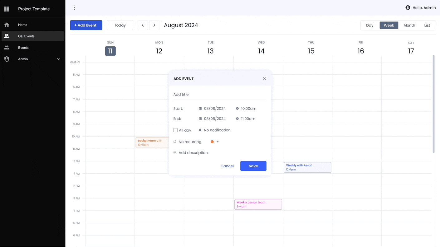
Add Event
Before
%20(1).png)
After

Edit Event
Before
%20(1).png)
After
.png)
.png)
.png)
.png)
bottom of page