top of page
.png)
ERP System
Overview
Legacy ERP system redesigned to modernize workflows, improve usability, and create a cleaner user experience.
The Problem
The system was built in 1995 with outdated UX, complex navigation, and inefficient screens that slowed daily work significantly.
Role
Product Designer (Sole)
The Solution
Redesigned the full ERP experience with clearer flows, modern UI, and optimized screens for faster work.
Challenges and Constraints
The legacy ERP system required a complete redesign to support modern business operations, improve efficiency, and create a more intuitive user experience.
Key challenges included:
-
Outdated screens that made everyday tasks slower and harder.
-
Inconsistent layouts and controls that reduced clarity between modules.
-
Complex navigation that forced unnecessary steps and repeated actions.
-
Every button click opens a new screen over the previous one, creating clutter.
Research
The redesign process started with analyzing the existing ERP system, user behavior, and operational workflows.
-
System Audit: Reviewed outdated screens, navigation patterns, and daily pain points across key modules.
-
Workflow Mapping: Rebuilt task flows to simplify actions and improve speed for employees.
Optimized User Flow and Design
-
Navigation Structure: Simplified menus and screen hierarchy for faster access to daily actions.
-
Unified Design System: Created consistent buttons, tables, forms, and visual patterns.
-
Modern Interface Upgrade: Refreshed outdated screens with cleaner layouts and improved usability.
Home Screen
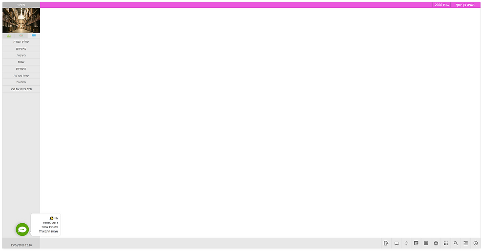
Before
The home screen felt outdated and lacked visual clarity, with no meaningful content displayed by default. There was no sense of system status, priorities, or actionable insights, and no clear visual hierarchy.
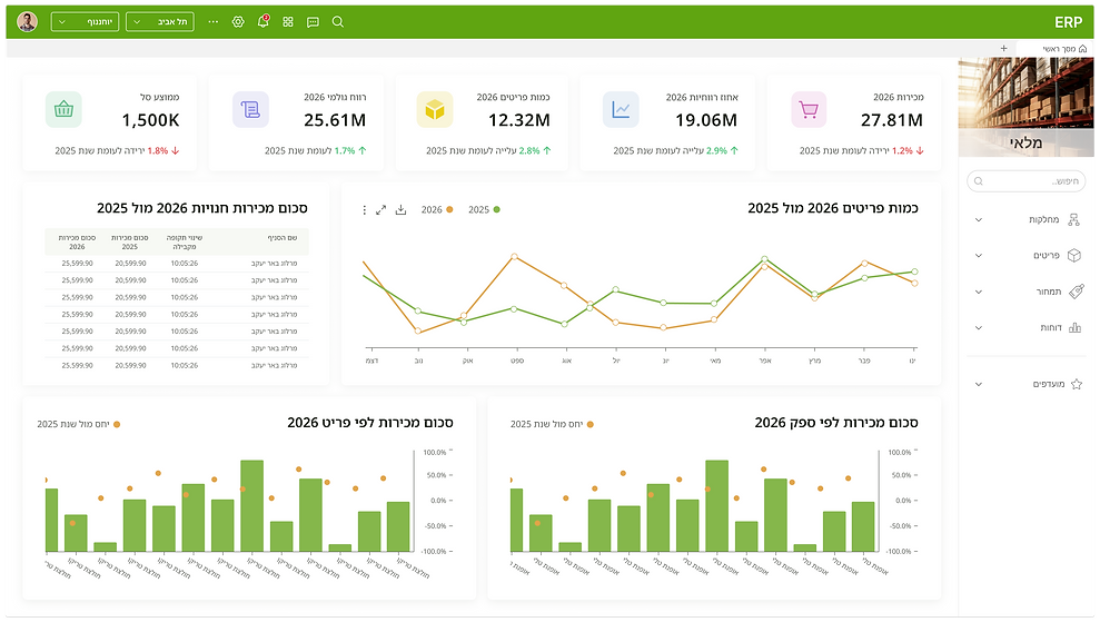
After
The redesigned home screen introduces a dashboard as the default view, providing users with immediate access to key data and insights upon entering the system.
A top navigation bar and a structured side menu were added to improve accessibility, create clear hierarchy, and support efficient navigation across the system.
Screen Behavior
Before
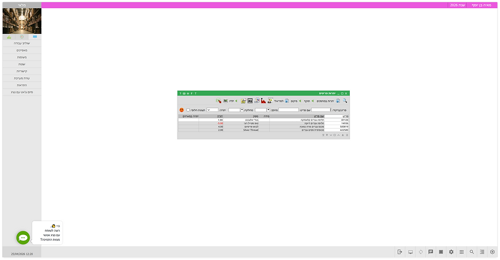
Screens opened centered on the home screen, and each new action triggered an additional screen layered on top of the existing one.
This behavior occurred consistently, regardless of whether the next screen was related to the current context or part of a different workflow.
After
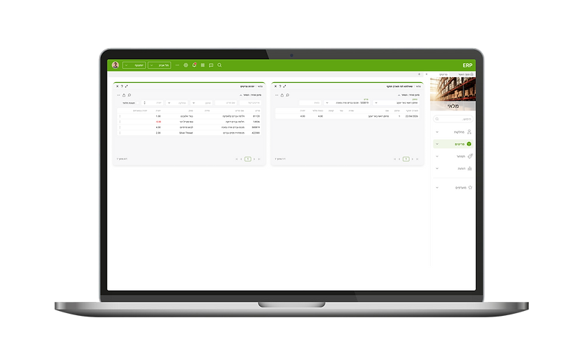
Independent screens open side by side instead of stacking, allowing users to maintain context and work across screens.
Screens can be repositioned freely, creating a flexible workflow.

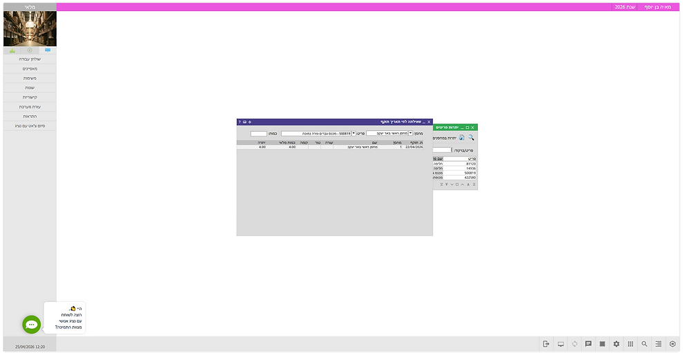
Before
In the previous system, contextual screens also opened on top of the current screen, interrupting the flow and making it harder to maintain context.
.png)
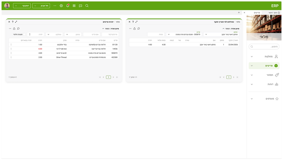
After
The redesign introduces a pattern where contextual screens open as a drawer within the current screen.
This allows users to stay in the same flow and maintain context, improving efficiency and task continuity.
Action Menu
.png)
Before
All actions were placed in a single top bar, with no clear structure or prioritization.
Row-level and global actions were mixed together, reducing clarity.
Selecting a row changed the available actions, leading to confusion.
The interface also included outdated icons.
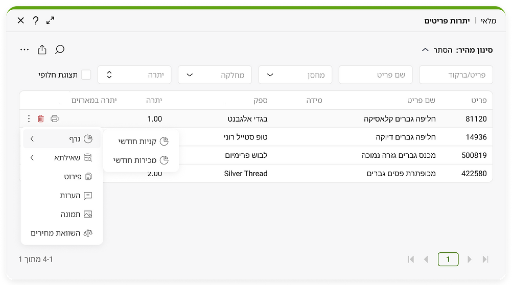.png)
After
The redesign introduced a clear separation between row-level and global actions.
Row-level actions were moved into a contextual menu within each row, while global actions were grouped in a screen-level menu above the table.
High-frequency actions were added as quick actions within each row for faster access.
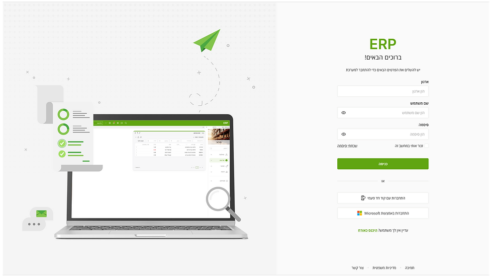
Login
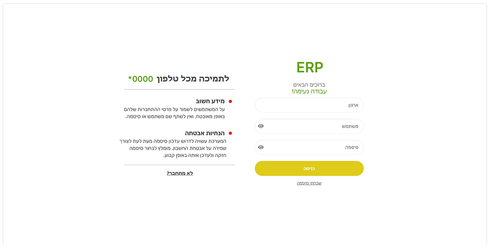.png)
Before
The home screen felt outdated and lacked visual clarity, with no meaningful content displayed by default. There was no sense of system status, priorities, or actionable insights, and no clear visual hierarchy.
.png)
After
The home screen felt outdated and lacked visual clarity, with no meaningful content displayed by default. There was no sense of system status, priorities, or actionable insights, and no clear visual hierarchy.
.png)
bottom of page